Dashboard Design: Data on the Surface, Logic Underneath

The best way to present complex logic is to provide infographics that help the team process information.
Visual memory is one of the most powerful tools we have, and when used correctly, it helps people retain and recall information much faster. That’s why, instead of burying teams in bullet points or layered documentation, I prefer infographics.
A well-crafted infographic, designed with intention and grounded in principles like Gestalt psychology, helps the brain process information better. These “old but gold” visual rules support cognitive understanding and help viewers make sense of complex details much faster and more accurately.
In dashboard design ( whether it’s a table, tile, or graph layout), users will see a set of data/information/numbers as a result. But behind that display is logic: calculated values or conditions that determine how the data appears.
And this is where it gets interesting.
As someone responsible for shaping the interface, you face two sides of the challenge:
First challenge: Understand the Need
This is the classic part of our work, the research phase, to answer all the questions and define the needs.
- What is the user trying to solve?
- Why do they need this information?
- How frequently will they use it?
- What is their process before/after they interact with it?
- What are their expectations?
Second Challenge: Align on the Logic
This part is just as critical and often overlooked. It’s still research, but it’s about validating and aligning. And I want to talk more about this...
We need to make sure to answer these questions and more (depending on the project):
- Do all stakeholders understand the logic in the same way?
- How is the data calculated?
- When does it turn negative or trigger warnings?
- What conditions change how it’s displayed?
- Can we implement the logic?
Because here’s the truth: we can present a dashboard screen that follows every UX best practice and still end up with confusion.
Let’s say the dashboard shows:
Date: Jun 25, 2025 – Jul 25, 2025
It might be accessible. It might check all the usability boxes.
But…
- What does it mean?
- Is it based on calendar days or business days?
- Is it 30 days or one month, or 21 days excluding weekends?
- Did you ask your users what they expect?
- Did you explain what logic the dashboard follows?
And here’s the tricky part.
Our brain plays a game with us called “survival.” It tries to fill in the blanks with the most familiar answer based on our own past experiences, and it does this unconsciously. We assume that what makes sense to us will naturally make sense to others.
So we think: Of course, the logic here is obvious. The way this data is shown is totally clear.
But the truth is… It’s not.
Everyone brings their own mental models, habits, and expectations based on their experience. And in UX, that means people will interpret the same data in different ways.
You’d be surprised how often teams discover mismatched understandings after a feature is shipped, and now it is no time to change the whole logic that can cost... well ... a lot.
That’s why aligning is just as important as understanding the user’s needs.
How Infographics Help with Validation
This is where infographics become more than just “nice to have.”
When I need to present logic-heavy interfaces, I create visuals that explain the conditions. Even a simple diagram can make a huge difference. It ensures that all stakeholders (users, engineers, managers, and other designers) are aligned.
I’ve seen these diagrams save hours of meetings and prevent misunderstandings during implementation. They’ve helped us build what was intended, not just what was assumed.
Final Thoughts
The next time you’re designing a dashboard or any feature with layered logic, show the logic behind it.
Use visuals to support understanding. Because no matter how polished the interface, if people don’t understand what’s underneath.
And yes, I still like using visual principles. They never get old when it comes to helping people make sense of what they see.
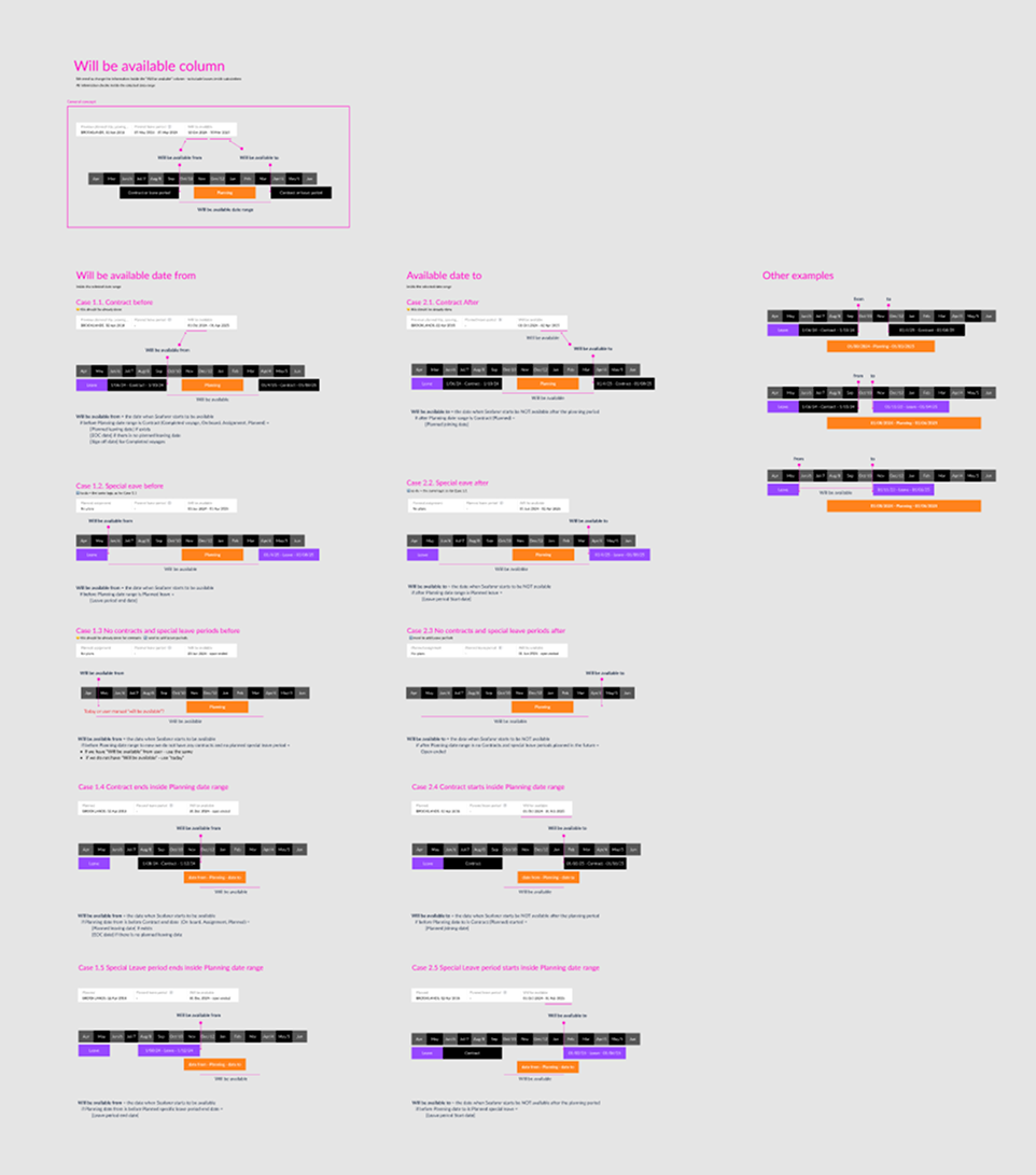
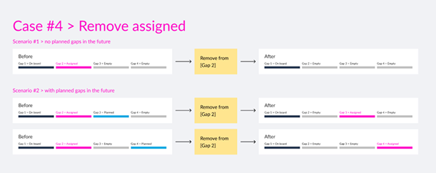
As an example, here’s a screen from one of my past projects where I mapped out all possible logic cases for the same data inside a table.
And that’s what dashboard design is.